Colour Psychology in Decorative Items: What to Add and Why
Walk into a room and you feel something before you think anything. Maybe it feels calm. Maybe it feels bold. Perhaps, it feels a little off and you cannot explain why. That reaction is not random.
The thing is, colours set the emotional temperature of a room within seconds. It tends to shape the mood, energy, and even how long someone wants to stay in that room.
The decorative items you choose are not just fillers for empty corners. They are actually signals. Moreover, they tell a story about your taste, your rhythm, and your lifestyle. When you understand colour psychology, you stop guessing and start designing with intention.
Why Colour in Decorative Items Matters More Than Furniture
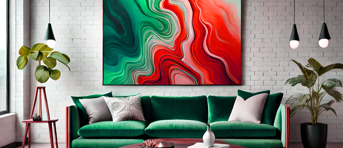
Furniture anchors a room, but decorative items fine-tine its personality. Cushions, vases, artwork, throws, candles, and lamps all operate like punctuation marks. They tend to emphasize soften, contrast, define. Colour is the language they use.
When someone steps into your space, their brain processes colour before shape of texture. Warm tones can energize a neutral sofa. Besides, cool accents can quiet a busy layout. Deep hues can add depth to flat walls. Additionally, light tones can make heavy pieces feel lighter.
Decorative items give you the freedom to shift a room’s atmosphere without replacing larger pieces.
Think it about this way: walls and furniture set the foundation; but colour in decorative pieces controls the mood dial. You can turn it up or down depending on what you want the room to communicate. That flexibility makes decorative items powerful tools rather than afterthoughts
Instead of randomly picking objects that “look nice,” start asking sharper questions. Do you want your living room to feel social and vibrant? Or grounded or reflective? Should your bedroom calm the mind, or add subtle drama?
Once you answer these questions, colour becomes a strategic decision instead of stressful
Warm Colours: Energy, Connection, and Confidence.
Reds, oranges, terracotta tones, and warm yellow carry movement. They tend to pull attention. They create focal points. When used in decorative items, they can energize a room without overwhelming it unnecessarily.
Red accents for example, introduce intensity and confidence. A deep red vase on a neutral console can anchor the entire arrangement. A rust-coloured throw can warm up a grey sofa immediately. These tones tend to signal boldness and presence.
They work especially well in living rooms and dining spaces where conversations and interactions matter.
Orange brings approachability. It feels social and lively. Decorative bowls, abstract art, or textured cushions in burnt orange can soften modern interiors that tend to feel too rigid. Besides, yellow adds optimism.
The key here is restraint. Warm tones attract the eye, so use them as highlights rather than floods. Let them punctuate your space. If every decorative item competes for attention, the room tends to lose its focus.
But when you allow one or two warm accents to take the spotlight, they create energy that feels intentional rather than chaotic.
Cool Colours: Calm, Space, and Subtle Sophistication
Blues, greens, and cool greys operate differently. They tend to expand visual space. They slow the pace. They invite you to exhale.
Blue decorative items often evoke clarity and quiet confidence. A navy vase, teal cushions, or indigo wall art can ground a bright room. Lighter blues create airiness, especially in small spaces where you want openness without stark minimalism.
Green connects a room to nature. Olive, sage, and forest tones bring balance. Decorative planters, botanical prints, or green-tinted glass can soften hard lines and introduce harmony. Green pairs beautifully with wood textures, woven materials, and neutral fabrics.
Cool greys and muted tones create subtle sophistication. They act as bridges between stronger shades. If your space already contains bold furniture or patterned rugs, cool decorative accents can restore balance without flattening personality.
Use cool tones when you want the room to feel layered but not loud. They create a steady backdrop that allows textures and shapes to stand out. Instead of shouting for attention, they draw people in slowly.
Neutrals: The Power of Restraint and Depth
Neutral does not mean boring. Beige, cream, taupe, charcoal, and soft whites shape the mood just as strongly as bold colours. The difference lies in nuance.
Neutrals create cohesion. They allow your decorative items to blend rather than compete. A room styled in layered neutrals feels refined because the drama comes from texture and contrast rather than colour intensity.
Consider a mix of cream ceramics, woven baskets, matte black candle holders, and linen cushions in soft sand tones. The palette remains calm, yet the room feels rich through variation in material and finish. This approach works well if you prefer understated elegance over bold statements.
Dark neutrals like charcoal and deep brown tend to add weight. They can make a space feel grounded and intimate. Additionally, light neutrals expand the space and reflect light, making small rooms feel open.
The secret to using neutrals effectively lies in layering. Combine glossy and matte finishes. Pair smooth surfaces with tactile fabrics. The truth is, when you use neutrals as dynamic rather than flat, your decorative items create depth without overwhelming the senses.
Accent Strategy: How to Combine Colours Without Chaos
Colour psychology becomes powerful when you combine tones with intention. A strong strategy keeps your space cohesive.
Start with a dominant mood. Choose whether you want the room to feel energetic, calm, dramatic, or balanced. Then select one primary colour family that supports that mood. Use it in larger decorative items like cushions or artwork.
Next, introduce a secondary shade that complements the first. For example, pair warm terracotta with muted sage. Or combine navy with soft beige. This creates contrast while maintaining harmony.
Finally, add one small accent that surprises the eye. A touch of gold, a deep emerald object, or a patterned piece can elevate the arrangement. The accent should appear in limited doses. Repetition of that small highlight across two or three decorative elements can tie the entire room together.
Avoid scattering unrelated colours across every surface. That approach creates visual noise. Instead, repeat your chosen palette deliberately. The thing is, consistency builds identity.
Choosing Colours Based on Room Function
Each space in your home serves a purpose. Let colour support that function.
In living rooms, use warm or balanced palettes that tend to encourage interaction. Combine soft neutrals with confident accent pieces to create an inviting yet dynamic environment.
Bedrooms benefit from cool tones or muted shades. Decorative items in soft blues, dusky greens, or warm greys can lower visual intensity. Keep contrasts gentle. Actually, the goal is to create a retreat rather than a showcase.
Dining areas can handle stronger contrasts. Deep tones like burgundy, navy, or dark green in candles, centrepieces, or artwork create intimacy and focus.
Workspaces respond well to clarity. Blues and greens often support concentration, while subtle yellow accents can stimulate creativity without distraction.
When you align colour choices with the room’s purpose, your decorative items move beyond decoration. They become the tools that shape your daily experience.
Turning Colour into Your Signature
Colour psychology offers guidance, but your personality should drive the final decision. Trends shift. Your identity remains.
If you gravitate toward bold contrasts, lean into them with discipline. If you prefer soft palettes, build depth through layering. The goal is coherence, not conformity.
Start small if you feel unsure. Swap out cushions. Add a new art piece. Introduce a bold vase. Observe how the room feels over a few days. Does it energize you? Calm you? Inspire you? Adjust gradually until the space reflects your rhythm.
Decorative items provide flexibility. They allow experimentation without commitment to large-scale changes. Use that freedom wisely. Choose colours that align with how you want to feel in your own space.
When you understand what each shade communicates, you stop decorating blindly. You design with purpose. And that shift changes not just how your home looks, but how it feels every time you walk through the door.